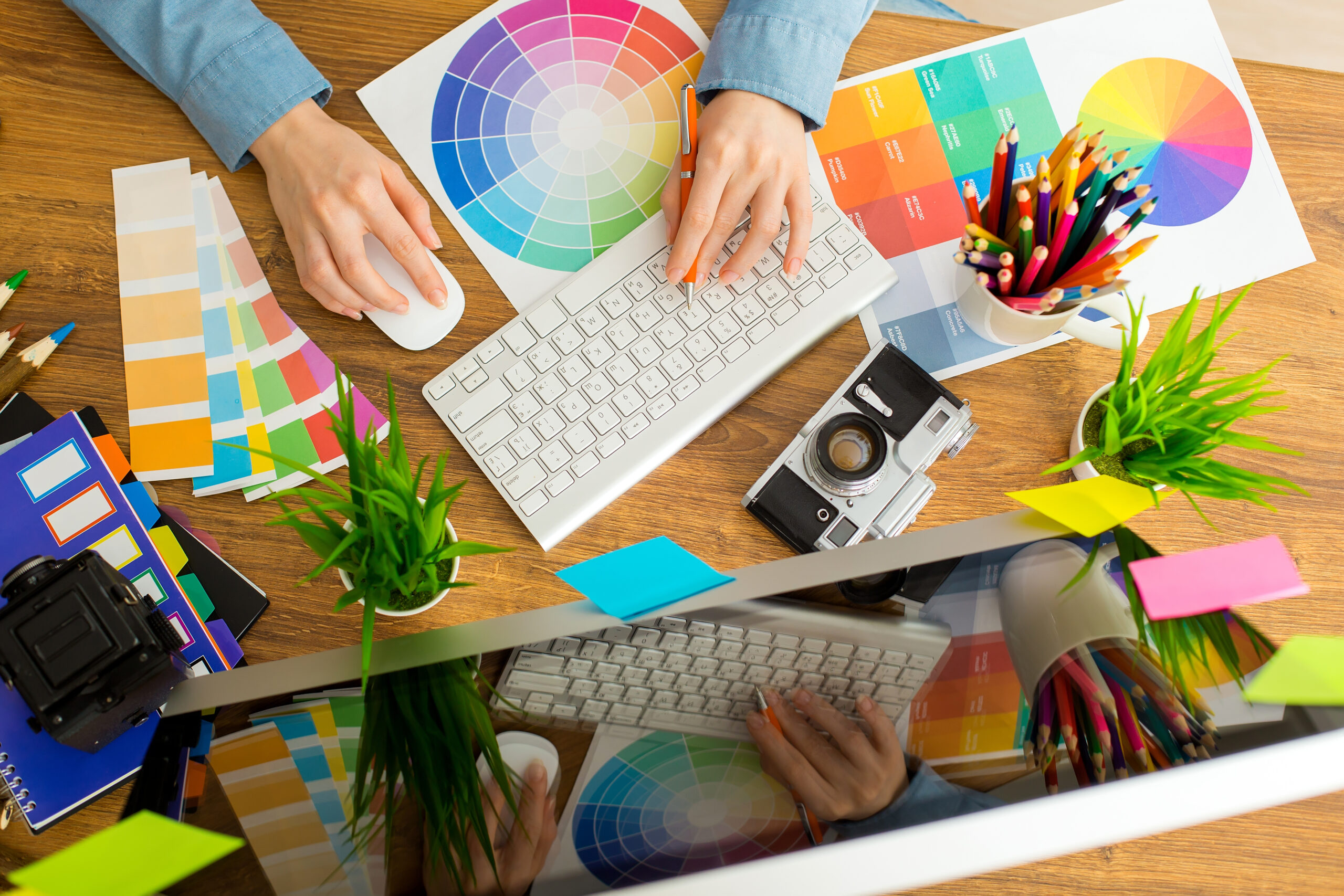
You’re allowed. In fact, we invite you to judge us by our cover, meaning our logo work. And for 2019, the 2TON team rolled out some solid work. Brand Logos are challenging; they are the primary identifiers of a business. Making one that works is a carefully executed, detailed process including hand drawings, mock-ups, several samples, and revisions. The main objective is, of course, to create something that clearly defines a brand’s products, services, ideas and signifies their culture as well. They have to look cool, too. Not an easy task.
Here’s what we achieved in 2019. We’re pretty proud.

Some (humble) thoughts from our designers.
DO's
- DO-Use a font that imitates the desired personality of the business.
- DO-Make logos that are versatile for all platforms; print, digital, web.
- DO-Design logos that are strong with the wordmark and strong alone.
- DO-Consider dimension.
DONT's
- DON’T-Use cliche fonts like Papyrus, Comic Sans, Hobo and so on.
- DON’T-Include too many elements or designs based on trends.
- DON’T-Forget to think about the target market.
- DON’T-Forget history. A brand’s logo can be refreshed and made to feel more modern without ignoring the past aesthetic.
Some (humble) thoughts from our designers.
- Combining multiple ideas to create simple, clean, geometric forms.
- Historical or vintage logo comebacks to add nostalgia and uniqueness.
- Playing with negative and positive space.
- Flat, with a touch of dimension.
- Hand-drawn elements.
- Detail over hyper-minimalism.
- Using advanced programs to create fonts and more distinct details.
- Clean and colorful.
Making a good logo is like finding depth in a Kanye quote…difficult. In 2019, our 2TON designers created some pretty awesome masterpieces for our brands. We’re looking forward to 2020.